I get heart attacks every time I use TMB net banking for transactions.
Once the money is debited from my account, the transaction status message gets displayed. It begins with a yellowish triangular icon inside which is a tiny black-colored tick mark.
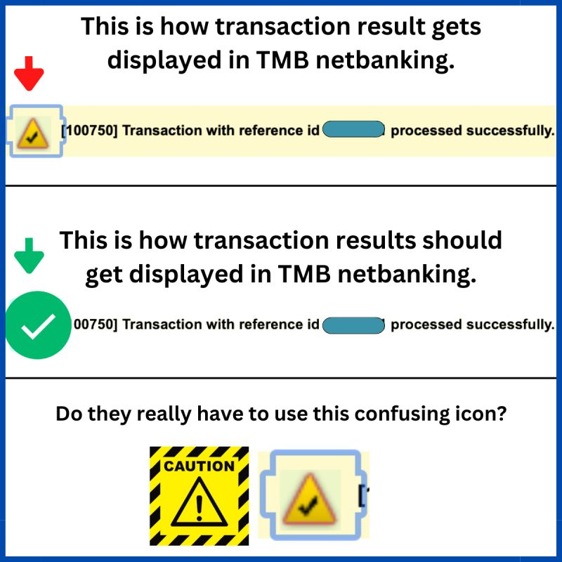
Taking away the tick mark, usually, we tend to associate the yellowish triangular icon with the CAUTION/WARNING sign. It’s globally understood.
The usage of such an inappropriate icon at the beginning makes me nervous.
“Has the transaction failed? Is the password wrong? Is money debited but not credited” – So many questions encircle my mind that I have to read the entire line in a hurry to understand what really happened, and I get relieved when I reach the last word ‘SUCCESSFULLY’.
Phewww!
A simple thick green tick (associated with success) could’ve very well served the purpose.
Tamilnad Mercantile Bank Ltd has total assets worth $5.4 billion, but I wonder how much do they invest in their UI/UX team.
Startups today face the challenge of delivering pleasant user experiences on every page of their website/app to keep their audience engaged. And, a fair share of responsibility lies on the UI UX team.
So, no matter how good your product is, if your design team is poor, you’re screwed big time, mate.
It’s the foundation of marketing, sales, user experience, and overall growth of your company.
This was first posted on my LinkedIn profile. It was promptly acknowledged by TMB’s team.
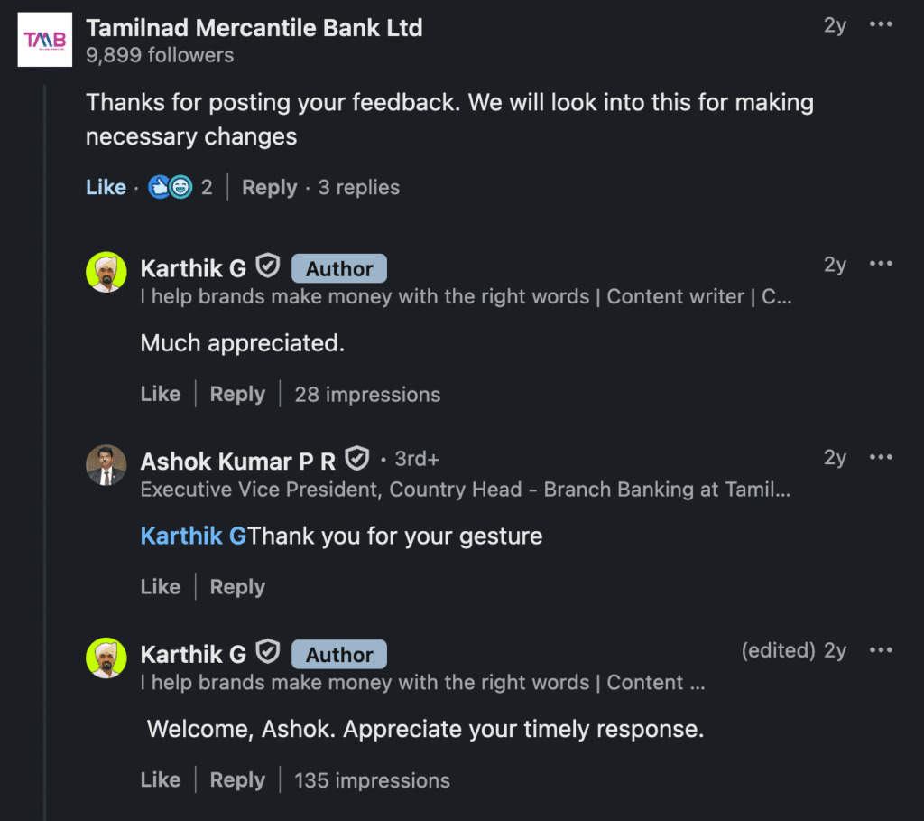
However, no action has been made yet on this. 🙁